Valentina Akpan: Founder, Rellatech. Admin and technical virtual assistant for businesses and startups with teams.
The Starting Point
The client had a working product, a brand, and a founding document that set out exactly how they wanted to grow and treat the partners they were about to approach. What they did not have was a website, and outreach was starting soon.
They asked for something simple. The real brief, once I read their founding document, was bigger. The site had to sound like them, because the partners they wanted would be reading it.
What I Did
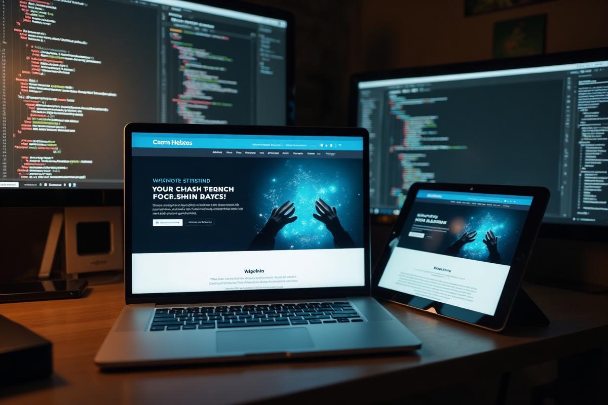
I started with design direction, not code. I built three sample landing pages in different styles and put them online the same day so the client could react to something real instead of a description. They picked an editorial, magazine style look, and everything after that was refinement.
From there I turned the founding document into the site itself. The hero headline is the client's own mission line. The values on the story page are their values, word for word. The partner page is written around their promise of partnership over transactions, with the founding partner program front and centre. Nothing on the site was invented for the site, which is why it reads like the brand and not like a template.
Along the way I added the parts a landing page needs to actually work: a contact page and a partner inquiry form that save every submission and email the team, per-page titles and descriptions, canonical tags, a sitemap, structured data for search engines, and social preview images. I also replaced the stock typography and animated the key sections in a way that echoes what the product does.
What Went Into the Build
Three sample directions, live the same day
Three landing page styles built and put online in a day so the team could react to real pages instead of a written description.
Editorial, magazine-style layout
The chosen direction: generous type, considered spacing, and a reading rhythm closer to a print feature than a template.
Copy pulled from the brand's own document
Hero, story, and values written from the client's founding document, word for word where it mattered.
Partner page built around their promise
A dedicated page for the partner program, framed around partnership over transactions, with the founding cohort front and centre.
Contact and partner inquiry forms
Every submission saved to the database and emailed to the client the moment it lands, so nothing gets missed during outreach.
SEO and social ready at launch
Per-page titles and descriptions, canonical tags, sitemap, structured data for search engines, and social preview images.
The Details That Took the Longest
The first version of the site was fine, and fine was the problem. Tiny label text, default fonts, and flat grids made it look like every quickly-built page online. We went through the sections one by one, sizing up the small text, swapping the fonts for a pairing with more character, and rebuilding the flattest section into an animated journey drawn from the brand's own mark.
Those passes are the difference between a site that works and a site the client is proud to send.
Where It Stands
The site is live on a staging link and the client is refining it with me ahead of connecting their domain. Their product will plug into the navigation the day it goes public, with the whole site already pointing toward it.
A landing page should sound like the person sending it, not like the tool it was built in.
Tools Used
Who This Is For
This case study is worth reading if you are:
- ●An early-stage team preparing to launch and starting outreach before you have a website
- ●A brand with a strong voice on paper that does not yet come through on the site
- ●A team that wants a landing page that reads like them, not like a template
- ●Anyone who needs SEO, lead capture, and email notifications set up properly at launch, not after the fact
Work with Rellatech
If you are launching something and need a landing page that sounds like you rather than like software, this is the kind of work I do on retainer. A short call is the fastest way to see whether it's a fit.
Contact MeRelated Services