
Valentina Akpan: Founder of Rellatech, providing administrative and operations support to executives, founders, business owners and teams. Her background combines technical support, customer success, administration and operations.
See the Live Work
The Starting Point
Kibbi is a Canadian hiring platform. Through its Restaurants Canada student initiative, school boards share Kibbi with students looking for their first job, so Kibbi needed a guide to help them spot fake employers and stay safe.
I wrote the post, "Your First Job: How to Spot a Fake Employer and Stay Safe", and built it in HubSpot. Once it was live, the founder looked at the rest of the blog and asked me to redesign it.
What I Did
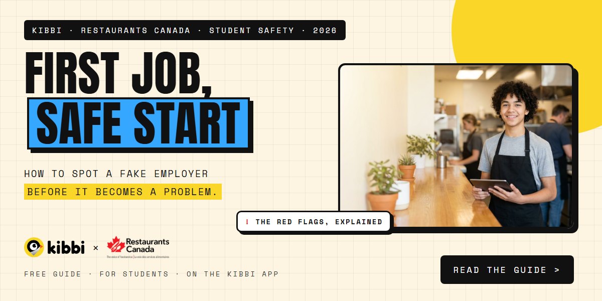
I redesigned that first post as a sample in a bold new style: a cream grid background, strong uppercase headings, highlighted key lines and card-style sections, with a matching header image. It was approved straight away, and I applied the same style to the rest of the blog.
I set the style up in one central stylesheet, so all 20+ older posts took on the new look and every new post matches automatically. I designed 20 new header images in the same style, each with its own headline, topic tag and the post's original image.
I rebuilt the blog listing as a card grid with topic filters and full images, where clicking anywhere on a card opens the post. I also cleaned up the writing across the posts: removed 77 em and en dashes, fixed typos and title capitals, and fixed text that showed as code.
Fixing the blog showed problems across the site. Pages ran on two different themes, so the header, menu and footer changed from page to page, some links went to the wrong place, and on phones pages scrolled sideways and buttons were different sizes.
So I revamped the whole site: moved every page onto one theme with the same header, menu and footer, reworked the layouts so each page fits any screen, and carried the new style across the homepage, partner pages and blog.
What Went Into the Work
The blog post
A youth job-safety guide for Kibbi's Restaurants Canada student initiative.
A new blog style
One stylesheet that gives every post the same bold, readable look.
20 header images
Branded headers in one style, so every post looks like part of the same blog.
A better listing
A card grid with topic filters and cards you can click anywhere.
One header and footer
Every page on one theme, so a change updates the whole site.
Built for phones
No sideways scrolling, even buttons and layouts that fit any screen.
Why It Matters
A hiring platform asks students, employers and associations to trust it. A site that looks different from page to page, breaks on phones or links to the wrong place works against that trust.
Now the site looks like one brand on every screen, and the team can publish new posts that match the design without touching any code.
What the Client Said
"Night and day! Much better."
"So much better than me doing it."
Tools and Skills Used
Blog writing, web design, HubSpot CMS, responsive layout, content editing and on-page SEO clean-up.
Who This Is For
This case study is worth reading if you are:
- ●A team whose website looks different from page to page.
- ●A business whose site breaks or scrolls sideways on phones.
- ●A HubSpot user who wants a blog that looks designed, without rebuilding the site from scratch.
Need help with similar work?
Tell me what your website or blog needs. I can write the content, redesign it and make it work on every screen.
Book a free call