
Valentina Akpan: Founder, Rellatech. Admin and technical virtual assistant for businesses and startups with teams.
Most small businesses do not have a bad brand. They have a brand that is being undermined by five or six tiny print and design mistakes. The website looks great, the social grid is tidy, and then the business card lands in someone's hand and the whole thing falls apart.
Here are the five I see again and again, and exactly how to fix each one.
1. Exporting in RGB instead of CMYK
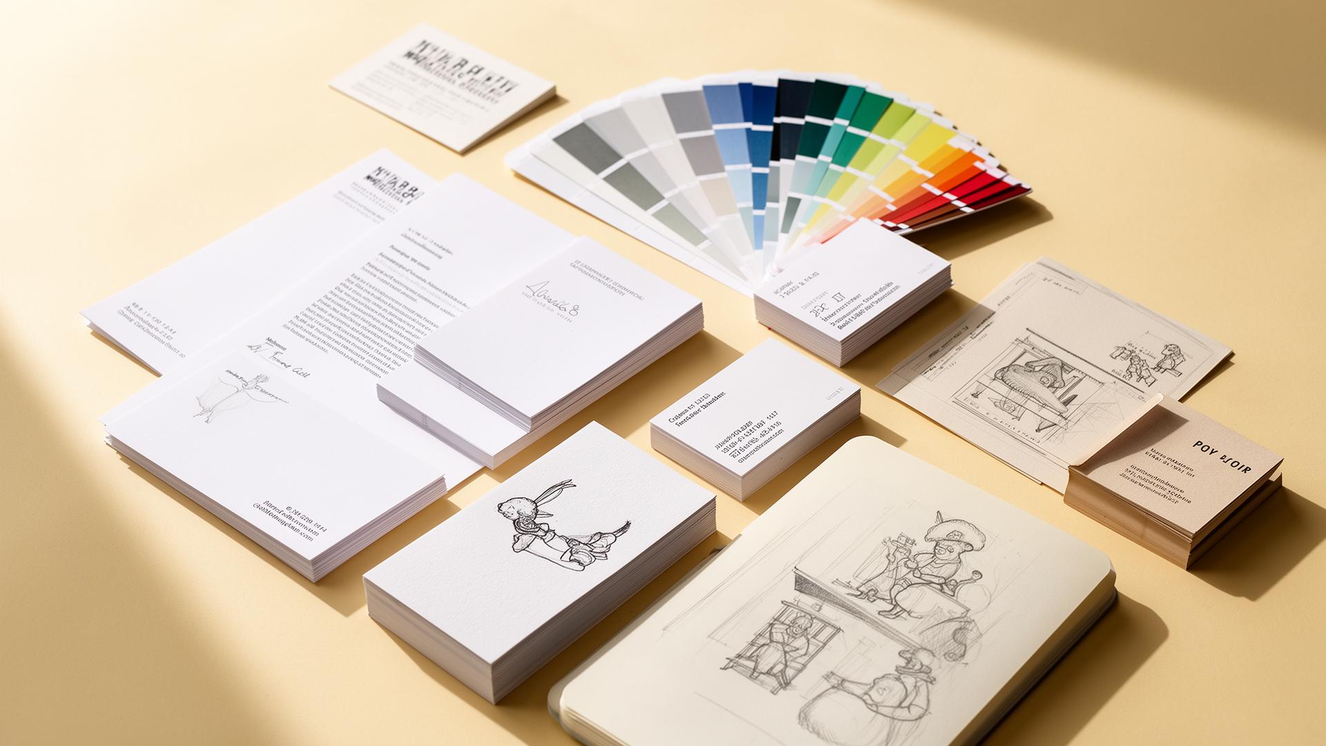
Screens use RGB while printers use CMYK. When you send an RGB file to a printer, the colors shift. Your bright teal turns muddy, your orange goes brown, and you blame the printer when it is really the file.
Fix it: set your document to CMYK before you start, or convert before export. Every serious design tool supports it. Canva Pro now exports CMYK PDFs, and Illustrator and InDesign have done it forever.
2. No bleed, no safe zone
Printers cut a stack of cards at once. The cut is never perfectly accurate, which is why you need 3mm of bleed around the edge and a 3mm safe zone inside. Skip them and you get white slivers on the edge of your card or your logo chopped in half.
Fix it: set bleed when you create the document. Keep all text and important elements inside the safe zone. Always export as a print-ready PDF with crop marks and bleed included.
3. Logos pulled from Google Images or social
A 200 pixel JPEG of your own logo is not a logo file. It is a screenshot. The moment you scale it up for a banner or a sign, the edges fuzz, the colors smear, and the whole brand looks cheap.
Fix it: get your logo in vector format (.svg, .eps, or .ai). One vector file scales from a business card to a billboard with zero quality loss. If you do not have one, this is the first thing to commission.
4. Three fonts where one would do
The fastest way to make any design look amateur is to load it with mismatched fonts. A serif headline, a script subhead, a sans-serif body, and a hand-drawn callout, all on the same business card. Visual noise. The reader's eye does not know where to land.
Fix it: two typefaces max, one for headlines and one for body. Use weight and size to create hierarchy, not extra fonts. Almost every premium brand you can think of uses one or two typefaces and nothing else.
Good design is mostly restraint, where the amateur adds and the professional removes.
5. Canva templates left exactly as Canva designed them
Canva is a great tool. The problem is the template you picked is the same template ten thousand other businesses picked this month. Default colors, default fonts, default layout, default stock photo. Your brand disappears.
Fix it: use the template as a starting grid, then replace every default with your own brand. Your colors, your fonts, your photography, your spacing. If the result still looks like the template preview, you have not customised it enough.
The pattern underneath all five
Every mistake on this list comes from the same place: treating print and brand design as a quick task instead of a craft. They are small details, but together they are the difference between a brand that looks like a real business and one that looks like it was put together over a weekend.
The good news is fixing them does not require a full rebrand. Most of the time it is a clean set of files, a tighter type system, and a designer who actually exports things correctly.
Work with Rellatech
Business cards, signage, packaging, and brand collateral are a regular part of what I do. Print-ready, on-brand, and built to match the work you do. If the above sounds familiar, a short call is the fastest way to see whether it's a fit.
Not ready for a call? Take the free operations assessment and I will send you a written breakdown within 24 hours.